

Project Brief
As part of the complete marketing strategy that The Idea Works set up with Islands Insurance (as it was then) was a need and desire to re-fresh the brand. A re-brand is second only, in my book, to a new brand creation, but I feel this one has been particularly successful.
The scope of the re-branding meant there were factors such as the relationship of islands to The National Farmers Union (NFU), and therefore consideration, sympathy and harmony to the NFU corporate design philosophy needed to be taken into account, and was – hence Archer being a common font in the identity of both.
The Challenge
As with many projects I take on, I always feel simplicity is always the answer.
The nature of the business demanded that a bona fide mature and corporate solution should be the goal, but making simple look simple is THE challenge and goal for every designer, and achieving simple takes allot of time, I assure you.
But once achieved, it will give a brand, hopefully, great longevity.
The Solution
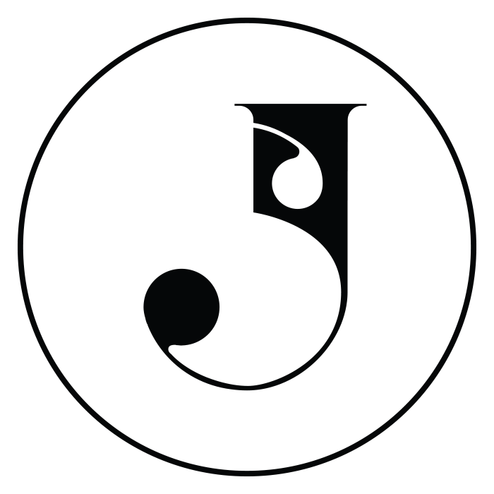
In the first instance, I wanted to create a logo that would have presence – so some form of display (bold) font would be required.
I essentially created a new logotype font from about 3 different ones. Where I didn’t think the “s” was sympathetic from one, I took from another. Where I didn’t like the character hints on the “o” I made it a geometric O. And not content with that I also put curves on the under and top sides of many of the characters to “soften” the final result.
There were many other elements but the key was also to have a link with the original Islands Insurance, and I achieved that simply by putting a double dot on the i. Sounds simple? All I can say is that I’m proud of the result, and proud that both The Idea Works and their client, Islands are happy with the result.
Islands logo design and re-brand.
Image gallery & lightbox
Image gallery & lightbox


